As highly visual beings, we tend to obsess a little bit about choosing the perfect color palette for our spaces. This is perfectly valid. After all, the colors we see significantly influence how we feel about our surroundings, as suggested by color theory.
Now, there are important considerations when deciding on a color scheme. One major factor is the interior style. Have you ever noticed how each interior design style features its own distinct color palette?
While there are no strict rules requiring you to adhere to a specific color scheme within a design style, some guidelines can help you achieve the look you envision and create a space you truly enjoy.
Modern Minimalist
The modern minimalist design emphasizes clean lines, ultra-simplicity, and functionality. This style often calls for a monochromatic color scheme, with black or gray as the base color or a heavy use of white.
Primary Colors: Muted colors like white, gray, and black
Accent Colors: Soft pastels like blush pink and soft green or a neutral color like taupe
Scandinavian
Scandinavian design is the epitome of a modern but cozy space, with an emphasis on simplicity, and natural light, functionality. The color palette is typically soft and airy, with a focus on neutral tones and natural materials.
Primary Colors: Simple, muted variations of white and gray, plus natural wood
Accent Colors: Soft colors of nature like sage green or soft blues, plus a pop of color like bright yellow.
Industrial
Industrial design focuses more on the authenticity of the materials like the raw and edgy texture of exposed brick, concrete, and metal. The palette often complements the look of these materials, with a focus on moody and darker colors.
Primary Colors: Black, gray, dark brown
Accent Colors: Rust, copper, gold
Art Deco
Art Deco design was the result of the intense experimentation with design in the wake of the Machine Age. It is mainly characterized by geometric shapes and luxurious materials. The colors are bold and glamorous, emphasizing rich jewel tones.
Primary Colors: Black, white, gold
Accent Colors: Bold colors like emerald green, sapphire blue, ruby red
Mid-Century Modern
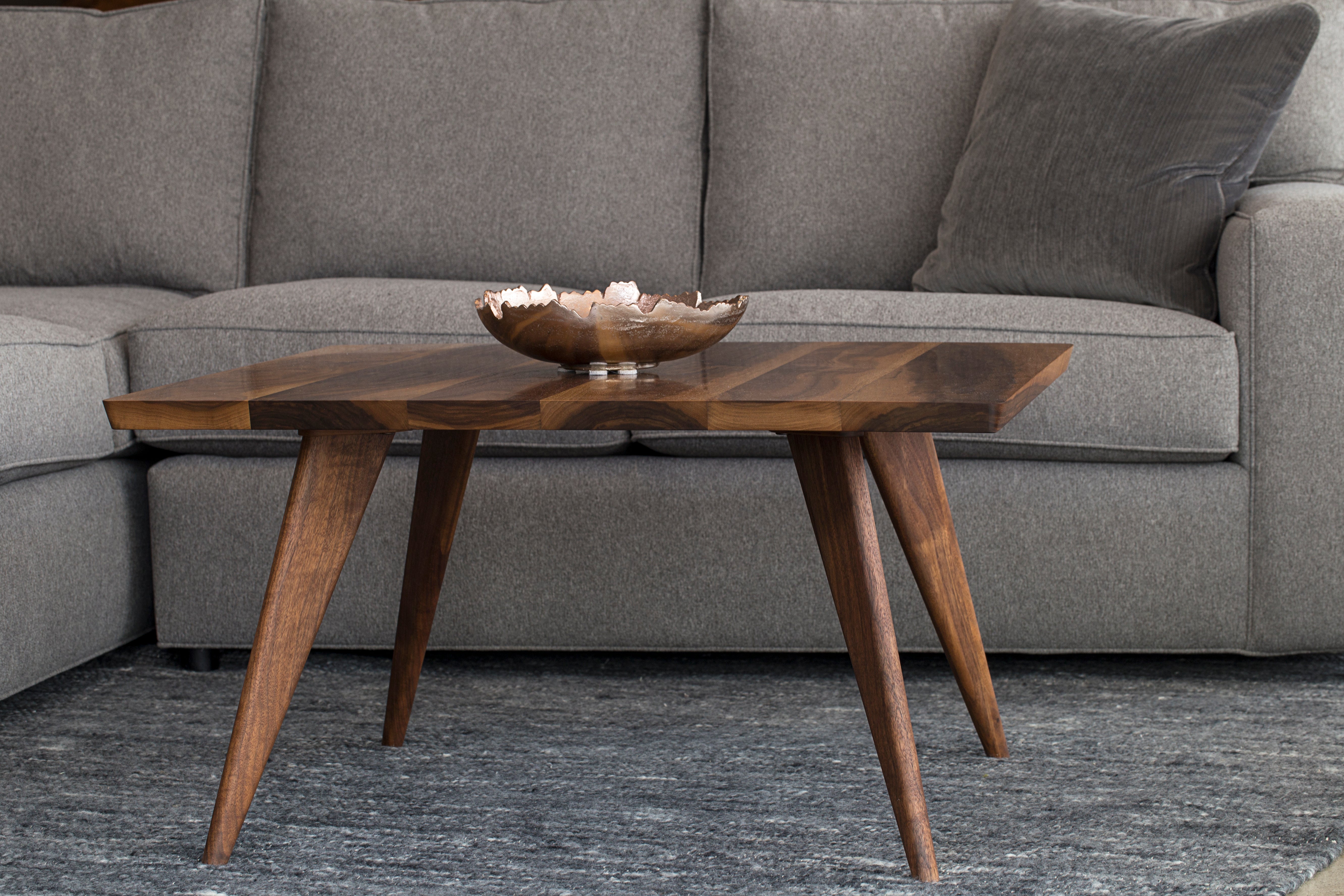
Mid-Century Modern design is distinguished by its sleek lines and natural forms, and a cozy, inviting ambiance. Earthy tones are the dominant colors, not unlike those of Scandinavian design only that the accents are brighter and warmer.
Primary Colors: Variations of black, brown, and white
Accent Colors: Teal, mustard, orange
Coastal
Coastal design is reminiscent of the sea and sky, often characterized by its relaxed, breezy ambiance. The color combination mimics the natural view of the coast, with plenty of blues, greens, and whites.
Primary Colors: White, light blue, and light gray
Accent Colors: Navy blue, cobalt blue, teal, and coral
Japandi
Japandi design blends Japanese minimalism with Scandinavian hygge. Its nature-inspired color palette is serene and understated, emphasizing neutral shades and the use of natural materials.
Primary Colors: Neutral tones like off-white, taupe, beige, and warm gray
Accent Colors: Dark gray, brown, soft green, and forest green
Rustic
A rustic design can encompass various interior styles, ranging from shabby chic to French Cottage. Similar to industrial design, it celebrates the authenticity of materials that are aged and distressed. This often includes features like exposed wood beams, stone and metal accents, natural wood elements, and weathered furniture pieces.
Primary Colors: Neutral colors and earth tones like black, brown, beige, and cream
Accent Colors: Warm colors inspired by nature like red, orange, yellow, green, and blue
Mediterranean
Mediterranean design, as the name goes, is inspired by the sun-kissed coasts of the Mediterranean Sea. The interior style is relaxed and inviting with plenty of textured features like stucco or plaster walls, exposed wood beams, and wood furniture pieces. The color scheme is a balance between earthy tones and vibrant pops of color as seen in intricate tilework.
Primary Colors: White, beige, terracotta
Accent Colors: Colors inspired by beautiful coasts including blue, green, yellow, red, orange
Bohemian
Bohemian design is eclectic and colorful, with features influenced by different cultures. The color palette is diverse and vibrant, blending earthy tones with bright, bold colors.
Primary Colors: Earthy colors like brown, beige, and terracotta
Accent colors: Warm colors like burgundy, mustard, and olive green, and bold colors like ruby red and emerald green
The 60-30-10 Rule for a Cohesive Color Palette
The "60-30-10" interior design rule is a simple guideline to help choose a color palette for your space and apply it effectively. It's basically about color proportions, a way to help you achieve balance, which is a core design principle that is often overlooked.
60% Dominant Color
This is the primary color that covers most of the space, like the wall paint color and the flooring, especially in open-plan spaces. It's usually in various shades of white, neutral colors like white, beige, and gray, or soft hues from the color wheel.
30% Secondary Color
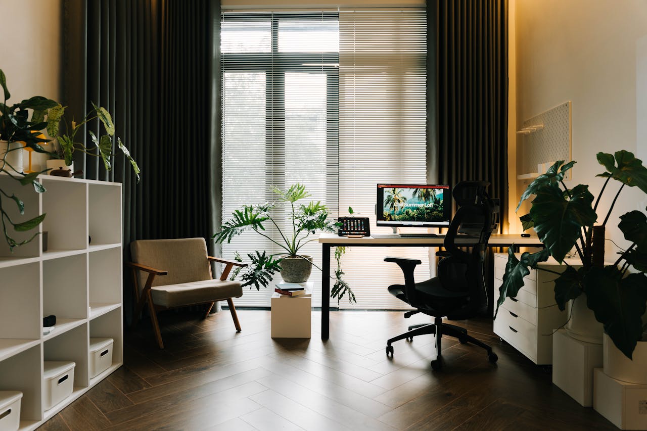
This color complements the dominant color and adds visual interest. It can be a slightly darker shade of the dominant color or a contrasting shade. Usually, this comprises the furniture, perhaps the area rug and curtains in a space with large windows. In a four-walled room, it can also be the accent wall.
10% Accent Color
This is the smallest color proportion, but the accent packs a punch. It's a vibrant color that's often quite different from the dominant and secondary colors. This slight pop of color usually comes through like decor (accent chairs, artwork) or in intricate details of the rug and furniture.
Choosing the Right Color Palette for Your Interior Style
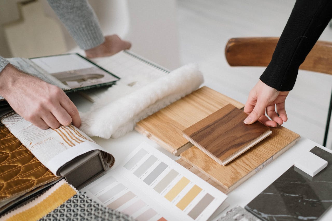
Once again, you don't have to stick to a specific color palette, even when that particular scheme is commonly associated with the interior style you've chosen. One important thing you actually need to consider is the mood you want to be in within your space. Do you want a calm and serene space, or something a little warm and stimulating?
Another aspect to consider is the lighting conditions in that space. The amount of natural light in a room plays a crucial role in how colors appear. Lighter colors easily reflect light, making the area seem airier and larger, which is a good choice for smaller spaces with poor lighting conditions. Meanwhile, darker colors make spaces more dramatic, especially in a large room with plenty of natural light but tend to make small spaces even tighter.
Now, our spaces reflect who we are, so don't hesitate to feature your favorite color. Don't be afraid to experiment (paint samples are your best friend) until you find the perfect colors that resonate with your personality.
Related Posts
- Colors That Work Really Well With Walnut Wood
- Why Maple Wood Furniture Is a Great Choice for a Serene Home Furniture
- Scandinavian Design: The Key Elements Behind Its Enduring Appeal
Featured Photo by cottonbro studio from Pexels


Leave a comment
This site is protected by hCaptcha and the hCaptcha Privacy Policy and Terms of Service apply.