You want to change something in your space. Sure, you can rearrange the furniture and throw in some trendy decor to improve the aesthetics. But changing the colors is the easiest way to refresh your space’s look. Surprisingly, many people find this task challenging, and maybe you’re one of them.
We totally understand why, though. Changing colors may entail repainting the wall and finding the right color “balance” for the things you already have. You might also feel that making a mistake may be permanent and irreversible. From this view, it is challenging, indeed.
But we got you. Selecting colors for your space doesn’t have to be an intimidating ordeal. The whole thing can be fun, and it’s an opportunity for you to know your space better. We’ll walk you through tips that might help you choose an interior color scheme—so you’ll love your space more and make it yours.
Tips on Choosing Colors for Your Space
What are your favorite colors? What colors inspire you or make you happy? Before doing anything else, these are the questions that you need to ask yourself first. You’ll be spending a lot of time in your space, so it’s important to make it fit your needs…and wants, which you’ll somehow fulfill through colors.
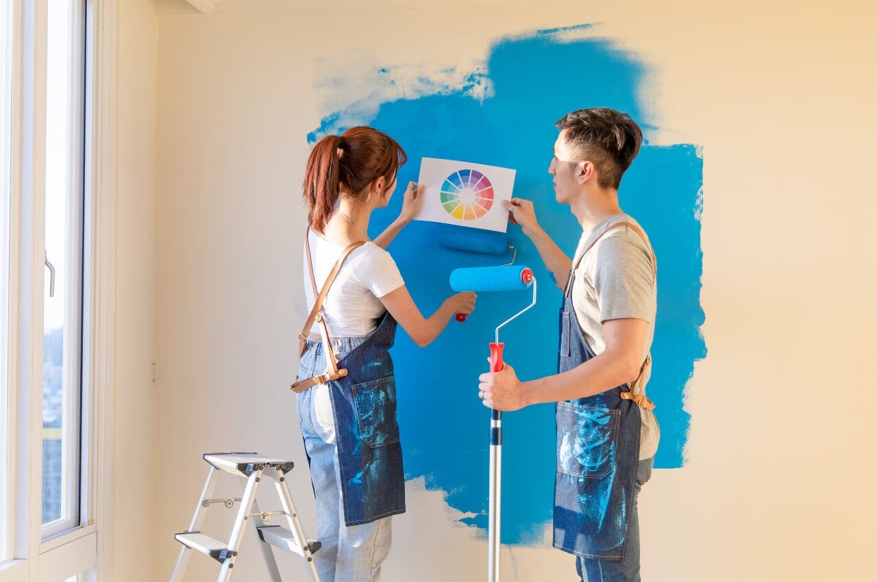
Knowing design theories, color theory, and the color wheel is a plus. But it's not entirely necessary to learn them to choose a color palette for your space (again, it’s a plus, BUT). You don’t have to follow them either. What’s truly important here is picking colors you like and are comfortable with. Answer the questions above, and from there, you can start and work around these tips.
1. Consider the Less Workable Objects First

You’re inspired, and you have found the colors that you want. But don’t head to the hardware store and buy paint cans just yet. Choosing the paint colors can come after considering the less flexible elements in your space. These may include flooring (tiles, hardwood, exposed concrete), upholstery, curtains, furniture, fixtures, and so on.
Unless you’re overhauling or completely renovating your space, it’s better to base your paint colors on elements in a room that you can’t change immediately. Simply put, paint is typically less expensive than new upholstery, furniture, and flooring.
Take note of the dominant colors among your less workable objects, then choose paint colors and decor that match them.
2. Think About the Impact of Lighting

Lighting and color significantly impact each other. Observe the lighting conditions in an area to maximize the effect of colors in your space.
For example, you may have limited access to daylight. If you want to enjoy as much natural lighting as possible, it might be better to opt for warm colors, pastels, and white. Conversely, if a room gets too much daylight, you can use darker and cooler colors to make the area moodier.
Compared to daylight, incandescent light produces a warmer light in reddish tints. Meanwhile, fluorescent lamps typically produce bluer and cooler light. So, how do they affect colors? Lighting with a blue tint may enhance greens and blues, while warm yellowish lighting may intensify red and oranges.
Lighting especially impacts white, which comes in wide varieties. White with warm undertones works in spaces with abundant natural light and makes larger spaces feel cozier. Meanwhile, while with cooler undertones help open up a space and may do well in areas with limited lighting.
3. Bring in Outdoor Colors

Allowing your surroundings to inspire you is a fun way to choose a color scheme. Consider the view from your window as wall art that enhances your space and take note of the colors that stand out.
From a stunning ocean view, you can pick out colors like cobalt, turquoise, navy blue, and white. If you have a view of the woods or the mountains, you might find that brown, green, and deep blue work for your space.
Bringing in colors of nature to your space can also be refreshing, especially if your immediate view is a concrete jungle.
4. Draw a Plan

There’s nothing like a well-drawn plan to assure you that your color scheme is okay. Planning things out on paper or digitally comes really handy when considering the visual flow from one room to another.
If you’re techy and have a lot of time to spare, you can go for 3D floor planning. But the good old pencil and paper planning work just fine, too. Create a sketch of your space or draw the floor plan on a grid—it doesn’t have to be polished.
Take note of your space’s most important elements and objects, like furniture, built-in cabinets, rugs, and flooring. Gather samples and paint chips representing their colors, allowing you to mix and match accordingly.
Of course, you can ditch the old-school way, too, and use phone apps that can help you visualize your space. There’s a plethora of options out there.
5. Choose a Color Based on the Mood You Want

The emotions evoked by different colors are not universal because how you respond to color depends on your culture and personal experiences. But some colors elicit a more consistent response from people. So, if you want to set a mood for a particular space, it might help you to know that:
- The color of the summer sky and the sea, blue naturally encourages a relaxing mood in a room. It also inspires security and stability.
- Yellow imbues warmth and energy. As a color for a room, it can make the space younger and more vibrant. But very bright yellows can also evoke uneasiness and frustration.
- Like blue, green also reminds us of nature. It can make your space look refreshing and invigorating.
- Red is a stimulating color that creates energy and excitement. A darker shade of red creates a moody aura, while a brighter tint can make your space more vibrant.
6. Remember the Paint Finish Matters

Paint comes in different finishes, typically matte, satin, and glossy. The main difference between them is the sheen. Matte doesn’t have an obvious sheen, which means that the color comes out as the actual color because it’s not easily affected by light. Satin has a pearl-like, velvety finish with a hint of shine. Glossy is shiny, reflecting the most light.
The paint’s sheen can influence your perception of color. For example, the same tint of red may look moodier in flat wall paint and more vibrant in glossy enamel. Getting the finish right helps you achieve the look you want for your space.
7. Play Safe with the 60-30-10 Rule

You can go by the 60-30-10 rule when applying colors to your space. The dominant color takes 60 percent of the space, 30 percent for the secondary color, and 10 percent for the accent. In a living room, for example, this may look like this:
- 60% for wall colors
- 30% for the upholstery (or perhaps an accent wall)
- 10% for the color of the throw pillows, vases, and other accent pieces