To say that the color of your room affects your life might be an exaggeration. But is it? Studies don't exactly demonstrate how colors have a direct impact on our lives. However, they do show evidence on how colors may influence our moods and emotions—the school of thought behind color psychology.
If colors play a role in our mood and emotions, perhaps they do have some degree of effect on our lives. Then, maybe we should pay more attention to the colors we surround ourselves with, especially the color palette in spaces we spend most of our time in.
In this post, let's explore how the colors of our space affect our mood and what we can do to maximize their impact.
Colors and Their Emotional Impact
As posited in color psychology, colors can influence human emotion. The way colors affect people largely depends on human experience, which is the basis of universal associations. Much of it is rooted in the things we see every day. For example, warm colors like red, orange, and yellow, reminiscent of the sun and fire, are often associated with strong and stimulating energy. While cool colors of the forests, seas, and mountains, such as blue and green, are typically associated with serenity and calm.
Colors not only impact emotion, but they may also have physiological and behavioral effects. Red, for instance, triggers alertness and a sense of urgency, leading to an increased heart rate and spurring people into action. Depending on the context, red may also prompt caution, provoke rage and desire, or encourage holiday cheer.
The way certain hues can evoke emotional responses can also vary, depending on culture and individual preferences. For example, white conveys peace and purity in Western cultures, but may evoke sadness and mourning in Eastern cultures. On a personal level, some people may see black as chic and sophisticated, while others perceive it as bleak.
What These Colors Might Make Us Feel in Our Spaces
A 2020 study found that "there is a universal basis for color-emotion associations," indicating that people tend to relate certain colors with corresponding emotions.
Although how people respond to colors is also shaped by cultural conditioning and personal experience, it can't be denied that colors are symbolic and may elicit a particular response. It's not by coincidence that people say cliches like, "I see red," to denote rage, or "I feel blue” to express melancholy.
Learning how certain colors affect you can be a great guide in creating an environment that feels right for you. Here is a list of colors and the emotional response they might represent in your space.
Blue
The color of the summer sky and the sea, blue, naturally brings serenity to a room. It also inspires security and stability. As you've noticed, many companies incorporate blue in their brand identity. The color helps them project and reinforce a reliable image to customers—think Facebook, Hewlett-Packard, or PayPal.
Blue works well as a bedroom color because it's relaxing. Shades of pale blue create a calming space and are bright enough to maximize natural light, while deeper shades of blue work well as accent walls to add visual interest and contrast.
Green
Green, more than blue, represents nature. It's often associated with growth and vitality, which is why it's frequently used to symbolize health and wellness.
Because green is invigorating without being overstimulating, it's a good choice for interior walls. Muted greens, like sage and olive, are popular choices for paint colors and are often paired with white. Meanwhile, darker shades, such as emerald or forest green, are also trendy as secondary colors, as you might have seen in kitchen cabinetry and the backsplash, and accentuated with brushed gold or brass hardware.
Green is key in biophilic design, which can be artificially incorporated through wall paint colors, textiles, and other accent pieces. However, having actual plants and lush greenery in spaces provides revitalizing energy like no other.
Red
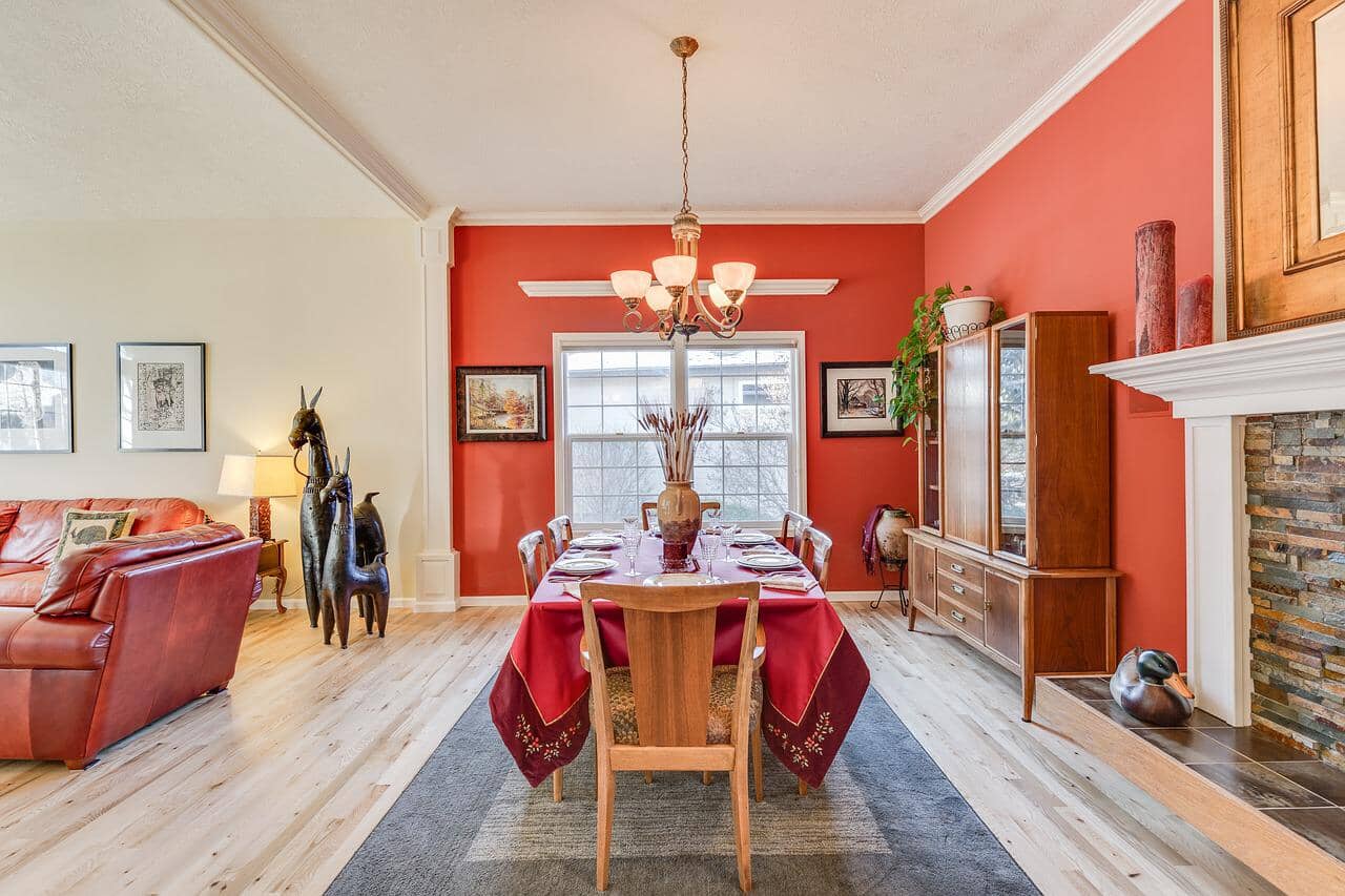
Have you ever noticed how red is widely used in fast-food chains and food products? It's because the color can help trigger appetite and create a sense of urgency. Red is a stimulating color that encourages more energy and excitement.
While its tendency to be overstimulating means it isn't always the most popular choice for interior spaces, red still is a good option when used strategically. A punchy red in textile and artwork can add visual interest and a touch of personality to rooms with a neutral color palette. The color may also work well as an accent wall to add a luxurious and dramatic layer to the space.
Pink
Pink, a desaturated red, has a soft energy that's quite different from the stimulating aura of its parent color. It's often associated with love and nurturing.
While bright pink is also stimulating, it's more lively and playful than passionate and urgent. It's a great accent color to greens and blues. Light pinks, meanwhile, are especially calming, making them a good choice for bedrooms, nurseries, or any space that needs gentle comfort.
Yellow
Yellow, reminiscent of the sun, imbues warmth and energy, and is often associated with joy. The color also tends to stand out more than others, which is why it's a common choice for warning and safety signs. It's also often used in food branding, along with red and orange.
As a color for interiors, soft and muted yellow can make the space feel younger and more cheerful. Deeper shades of yellow, like mustard or ochre, can add visual appeal as accents. Tread lightly with yellow paint colors, though, because too much yellow can also evoke uneasiness and anxiety.
Orange
Orange is full of warmth and personality, with the power of red and the joy of yellow in one color. It's not as intense as red and doesn't starkly stand out the way yellow does. In marketing, orange is often associated with optimism and creativity.
Warm orange is a great accent for a color scheme that needs a touch of playful energy. Even just a touch of orange, say a pillow, vase, or painting, can brighten up a space. To use orange to cover larger areas, consider a muted, earthy orange like terracotta or rust.
Black
Black is often associated with gloom and death, but also mystery, power, and sophistication. When used with other colors, black adds definition. On its own, it conveys simple elegance, like the logos of Chanel, the BBC, and Adidas.
Using black in interior spaces, especially as wall paint colors, may seem too intense and overwhelming. However, it can actually ground the space when thoughtfully considered in a color scheme. It adds depth and definition, helping other colors to stand out even more.
White and Other Neutral Tones
White is often associated with purity and cleanliness. It reflects light well, making spaces feel brighter and more spacious. Because of this, white walls are very popular—the default color, the blank canvas.
While some might see white as "safe," there's an advantage to its simplicity. It provides the opportunity to layer bold colors, patterns, and textures. If white seems too sterile, other light neutral colors, such as cream, beige, and soft gray, may provide a similar effect but as a warmer base.
Natural Wood, A Pair to Any Color
You spend a significant chunk of time indoors, mostly at home in the bedroom, home office, or living room. Knowing that colors can affect mood, it only makes sense that these spaces should feel right by choosing colors you resonate with. Infuse your space with good energy. If you want to make your space livelier, consider adding orange or red accents—blues and greens if you want to make it calmer.
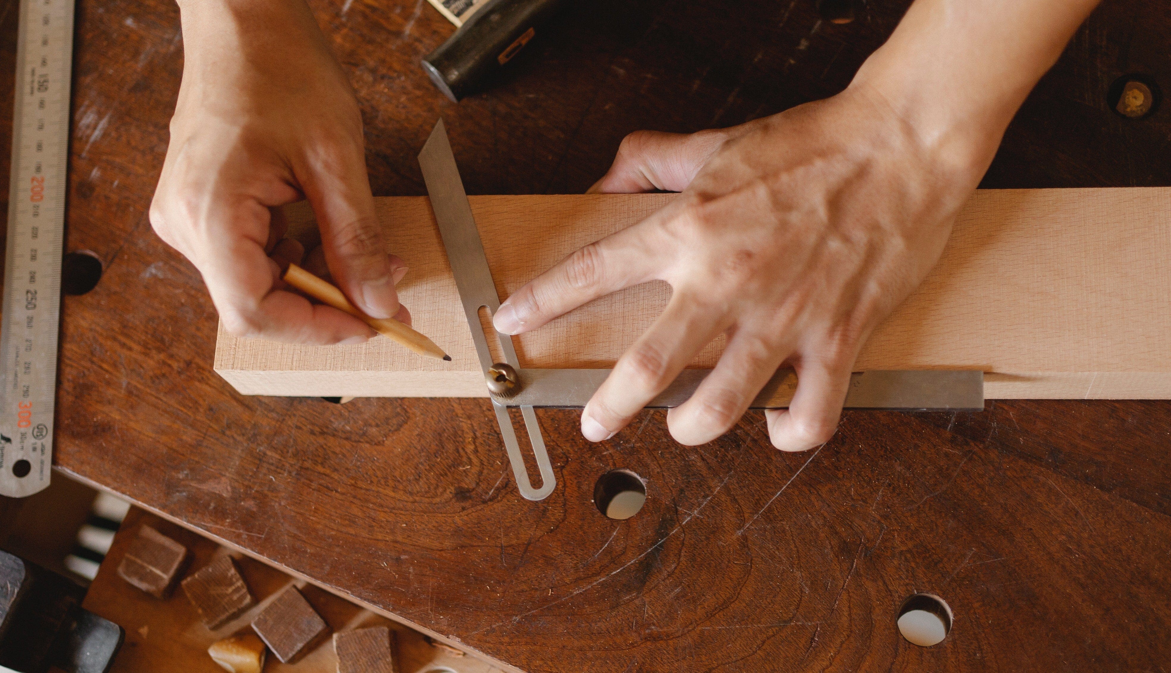
It's normal to feel a little reluctant about using certain colors. Any hesitation you might have often stems from a lack of confidence in styling, especially when pairing wall paint colors with furniture. You'll be pleased to know that T.Y. Fine Furniture tackles that concern head-on. We create timeless pieces that highlight the beauty of natural wood.
One of the many reasons we love working with real hardwood is its versatility. It has warmth and character that complement nearly any color. You can feel a little assured choosing solid wood furniture for your space, no matter which color speaks to you at the moment. If you need help picking out the type of wood, feel free to contact us for color consultation.
First published June 10, 2022.
