Complementary colors are an easy way to create a bold and beautiful space. Many people prefer neutrals for home interiors and shy away from rich colors, especially with the rise of minimalist and modern interior styles.
But a complementary color scheme might suit you if you want to make your space pop. The secret is using complementing colors in the proper ratio, and you’d be surprised at the stunning combinations you can create from them.
What are Complementary Colors?
Look at the traditional Red-Yellow-Blue color wheel or model. Those colors that sit opposite to each other are the complementary colors, which are basically:
- Orange and blue
- Red and green
- Yellow and purple
Other color models produce different complements, including red-orange and aqua, yellow-orange and indigo, and blush pink and sage, to name a few.
The complementary color to one of the primary hues—red, yellow, and blue—is a mixture of the other two colors. For instance, complementary to blue is orange, which is yellow and red combined.
Complementary colors, when mixed (as in mixing paint, for example), cancel each other out, producing neutral colors. But it’s another story when complementary colors are juxtaposed. They make each other appear brighter, resulting in a high-contrast color combination that is bold and pops.
Do Complementary Colors Go Well Together?
Yes, they do! Many artists use complementary colors to grab attention because of their interesting contrast. So many businesses use them for branding, and here are some very familiar examples:
- Google. The reddish hue complements the cool colors blue and green (blue especially) and works really well with yellow.
- LA Lakers. Purple and yellow, two highly saturated colors, bring energy and life to the brand.
- Mountain Dew. Green and lime green represents refreshment, and red complements both, adding vibrance and excitement.
Complementary colors in graphic design can work effectively, but they may not exactly impart the same effect in interiors. They can appear “too much” or overstimulating for indoor spaces, which may not be ideal if you want a relaxing ambiance. This is why many homeowners avoid playing with these colors and go for monochromatic and analogous schemes instead.
Sure, using complementary colors is a little tricky, even intimidating. But these colors make spaces more interesting and alive, which is why a complementary color palette is worth a shot.
Follow the 60-30-10 Rule

So, how do complementary colors work in your home? First of all, let’s take a look at another color wheel. You can see the colors in various shades and tints. This means you have many complimenting colors to choose from.
You don’t have to work with vibrant colors if they seem too loud. You can use desaturated hues or pair soft tints with saturated colors. Whichever complementing colors you think work, go for it. The trick is getting the proportion of these colors right, which is where the 60-30-10 rule comes in handy.
The rule is more like a flexible guide. You can certainly adjust as needed, but it usually goes like this—the dominant color takes 60% of the space, 30% goes for the secondary color, and 10% for the accent color.
In a living room, for example, this may look like this:
- 60% for a wall color that is neutral
- 30% for the upholstery, which is a desaturated color of a complementary pair
- 10% for the vibrant color of the complementary pair, which can be allotted to throw pillows, vases, and other accent pieces
Again, this rule is not absolute. Adjust the proportions as you like. Play with the different tints and shades to achieve balance, like pairing warm colors with hues with cool tones.
Complementary Color Scheme to Make Your Room Stunning
Using complementary colors in color schemes is one way to make your space vibrant and aesthetically pleasing. Because your eye naturally focuses on certain colors, some peach decor really stands out in a turquoise room. Two “opposing” colors stimulate different parts of the eye at the same time, which is why a combination of two complementary colors may help make a room appear balanced.
Red and Green
Color combination examples:
- Cherry and emerald
- Pink and sage
- Raspberry and mint
- Carnation pink and sage

The deep green wall, almost like emerald, brings a touch of elegance to the room. Combined with this shade of deep red from the chairs (with cool purplish tones), the effect screams vintage and luxury.

Softer tints of green and red, like sage and pink, on the other hand, can make a room appear warm and relaxing, a perfect combination for a bedroom.
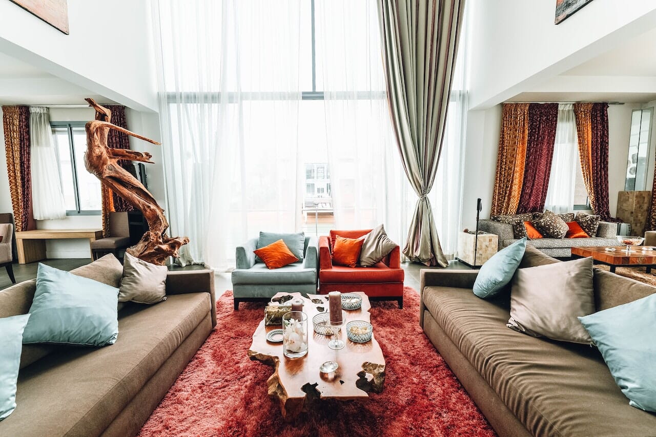
Blue and Orange
Color combination examples:
- Light blue and vibrant orange
- Peach and turquoise
- Navy blue and tangerine
- Coral and seafoam green

A dominantly white room becomes cool with a blue accent wall. But a punch of color from the orange throw pillows brings a certain degree of warmth and playfulness.

Light blue, meanwhile, provides a touch of relief in a room with dominantly warm tones. The contrast between warm and cool tones is stark, but it works because the space still appears balanced.
Yellow and Purple
Color combination examples:
- Yellow primrose and lavender
- Buttermilk and eggplant
- Chartreuse and periwinkle
- Thistle and cream

The yellow chair stands out in a light and airy room and works really well against the soft lavender chair and freestanding partition.

Purple and gold are the perfect pair of colors for a moody but elegant bedroom. Even when a room is dominantly purple—the walls a darker but seemingly neutral shade of purple—it's still vibrant enough with the varying shades and tints from the sheets and painting.
Related Articles:

